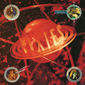
Check out how not all the letters are the same type of neon. Love it. It reminds me of an uber-extreme version of the Picturehouse logo.
And taking some visual cues here

And here


Typophile Film Festival 5 Opening Titles from Brent Barson on Vimeo.

From designer, Ken Perlin: "I wanted to design the smallest screen font that would actually be readable. My design assumes that screen pixels are horizontal striped as RGBRGB, as are most LCD screens these days"
See also smallest typeface.