Thursday, April 30, 2009

New Typeface for Roadways

The ‘overglow’ of the bright white letters on the darker reflective background of traffic signs makes it hard to read the signs. Thus a clearer one was created. Clearview Typeface. From the NYT.


Sunday, April 26, 2009

New Detroit Lions Custom Type

Paul over at UniWatch HATES the new Detroit Lions unis. I, however, think they are a HUGE improvement from the previous design. I appreciate the fact that they didn't completely overhaul the design, but gave it a subtle, contemporary look.

Note the new wordmark with custom details to complement the "fierce" Lion logo.


This customization applies to the numeral typography, as well. Check out the swoopes in the corners of the numbers.

C'mon Paul. MUCH better than last year's hideocity.

Monday, April 20, 2009

Thursday, April 16, 2009

Beautiful Vintage Porsche Posters


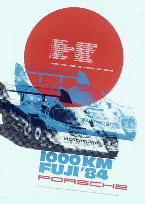
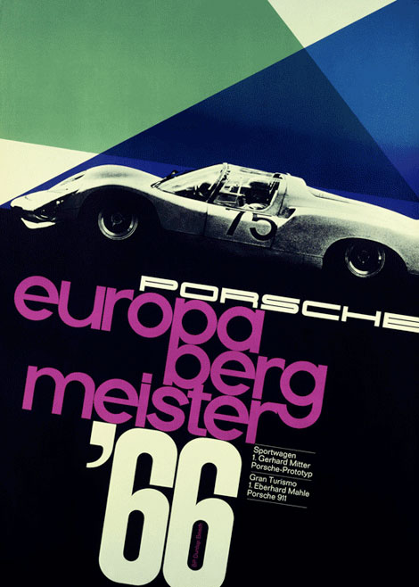
When I was 10, I wanted a Porsche 911 Carerra when I grew up. Still have time...

Love these posters from Grain Edit. More here.

Monday, April 13, 2009

How the typeface Sand ruined the most amazing video in months


Click here for the truly amazing video. (Take your Dramamine®)

The typeface "Hawaiian Starlight" in Sand makes me want to hurl more than the spinning of the stars.

Thursday, April 2, 2009

Typography In Venice

Kudos for Sam for finding this awesome poster on the streets of Venice, CA. You can really tell a lot about a person by the handwriting (and, of course the misspellings and punctuation).

Wednesday, April 1, 2009