
 Cool shirts. Check out more here.
Thursday, December 17, 2009
Tuesday, December 8, 2009

Friday, November 20, 2009
So Disappointed - Brothers Typeface
Why is it that studios market a film with a killer type treatment and then when it's time for trailers and the actual movie, they resort to boiler plate, status quo boringness?
Case in point, "Brothers". The typeface on top is used in the one-sheets and obviously, the site. Love the disjointed cut style on the bottom.
But the trailer has the old stand-by. Trajan. What gives?

Case in point, "Brothers". The typeface on top is used in the one-sheets and obviously, the site. Love the disjointed cut style on the bottom.
But the trailer has the old stand-by. Trajan. What gives?

Wednesday, November 11, 2009

Wednesday, September 30, 2009
Kick Ass Zombieland logo
Check out how not all the letters are the same type of neon. Love it. It reminds me of an uber-extreme version of the Picturehouse logo.
And taking some visual cues here

And here
Monday, September 28, 2009
5th Typophile Film Festival Opening Titles
Typophile Film Festival 5 Opening Titles from Brent Barson on Vimeo.
Beautiful handcrafted type treatment trailer by BYU design students and faculty, for the 5th Typophile Film Festival. I love the tactile-ness of the typefaces, and according to the post, everything in the film is real—no CG effects. HT to art director Jennifer Lai for shooting this my way.
Wednesday, September 23, 2009
Another 3 pixel high typeface

From designer, Ken Perlin: "I wanted to design the smallest screen font that would actually be readable. My design assumes that screen pixels are horizontal striped as RGBRGB, as are most LCD screens these days"
See also smallest typeface.
Wednesday, September 9, 2009
TypeRadio Podcast
Tuesday, August 11, 2009
CUSTOM LETTERS at COMIC CON 09
“You wanna take a picture of what?” he asked.
“The letters.”
“The letters?”
“Yes. Some of the lettering.”
“And why is that?”
“Because…I like letters.”
From LetterCult

“The letters.”
“The letters?”
“Yes. Some of the lettering.”
“And why is that?”
“Because…I like letters.”
From LetterCult
Tuesday, July 28, 2009
Toyota Creates A Font
The concept and process are hella cool, but the end result is a bit underwhelming.
iQ font - When driving becomes writing / Full making of from wireless on Vimeo.
Monday, July 6, 2009
Turn it off, you're wasting fonts.

Interesting typographic sculpture from the portfolio of Richard J. Evans exhibited at Free Range Graduate Art & Design Show.
Saturday, July 4, 2009
NEO DECO. Damn gorgeous typeface.

Alex Trochut is a freelance graphic designer from Barcelona. With a love for type and illustration he has created a variety of work for clients including Nike, Microsoft Zune, Cadbury's, LG, The Guardian, British Airways, Fallon, Non-Format, and The Rolling Stones.
Buy it here.
Monday, June 15, 2009
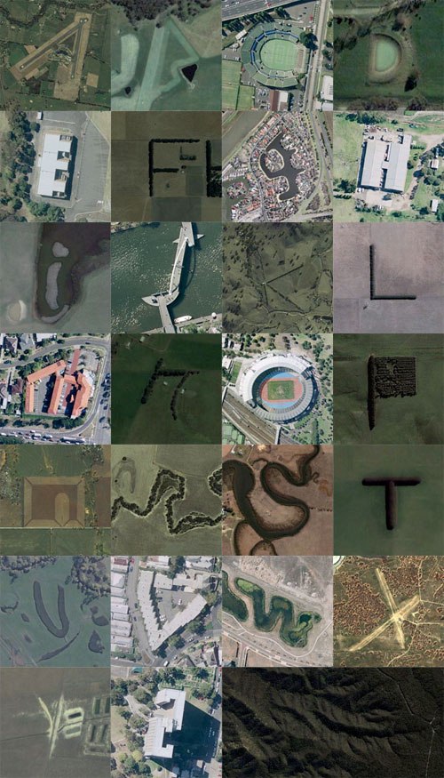
Google Maps Alphabet!
Rhett Dashwood's project, Google Maps Typography. Reminds me a lot of like Eric Tabuchi's truck letters which I think is pretty damn cool, too.


Monday, June 1, 2009
Hello Skateboards
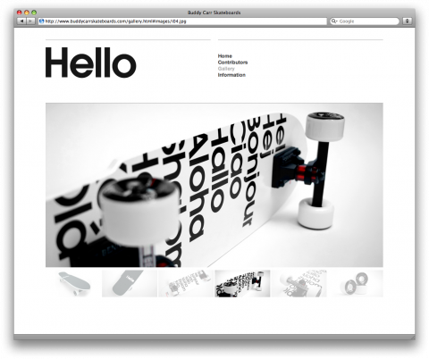
Hello is a collaboration between California based skateboarder Buddy Carr and New York based graphic designer Antonio Carusone. Pretty cool.
Sunday, May 31, 2009
Huge step in web typography
"Every major browser is about to support the ability to link to a font. That means you can write a bit of CSS, include a URL to a font file, and have your page display with the typography you expect. For designers and developers, this is a significant step forward. No longer will you need to trap your content in images or Flash just to express yourself visually. Pages will be more usable, accessible, and indexable. This is a massive upgrade for the web."
http://blog.typekit.com/2009/05/27/introducing-typekit/
http://blog.typekit.com/2009/05/27/introducing-typekit/
Friday, May 29, 2009
Movie Credit Type couldn't get any more squeezed

I rented Valkyrie this past weekend and turned to box over to see if that was in fact, Eddie Izzard (it was), but I needed to hold the box perpendicular to my face to actually read the type.
Thursday, May 28, 2009

Monday, May 25, 2009

Thursday, May 21, 2009
Good Job Conan!
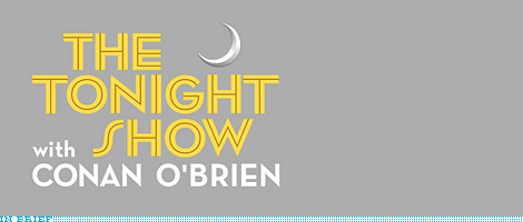
For its new logo, Conan explained his motives: “I wanted a logo that acknowledged the long, rich tradition of The Tonight Show while still looking good on hats, T-shirts, mugs, lawn furniture, notebooks, stemware, urns, defibrillators, water bottles, cell phones, sports equipment, pens, vacuums, chimes and our new line of unisex cologne.”
Where can I order my urn?
Looks like they used House Industries Neutra face. Great looking font. Although they should've used a real apostrophe.

It's a BIG improvement over the last logo.
Wednesday, May 20, 2009
Beautiful New Typeface - Deliscript

I was thrilled to check my email inbox this morning to find a very nice thank you note from superstar designer, Michael Doret for reviewing his then work-in-progress typeface, Deliscript. You've seen his work most notably the Knicks logo.
He even included a copy of this beautiful typeface. Which I can't wait to use. I wish I had it 5 years ago when I did the Carl's Jr. Pastrami burger commercial. There's a ton of signage in that commercial. I ended up using House Industries Sign Painter (along with real sign painters). But Deliscript would've been a hell of a lot better.
Love the attention to detail. There are so many alternates and different ways to set the text using the OpenType pallete. Love the tails and the ability to make them longer and choose different styles.

Truly a beautiful typeface. Buy it here.
Tuesday, May 19, 2009
Smallest Typeface
 3x3 is a typeface based on a 3x3 bitmap matrix. It was created by type designer Anders de Flon Those are some hard-working pixels.
The typeface has appeared on several record sleeves; a slightly modified version appears on the cover of LFO's Sheath, designed by The Designers Republic.
HT to the magnificent Don Lupo for the find
Monday, May 18, 2009

Wednesday, May 13, 2009
Steve Jobs Fontified

From the artist "This is a typeface-driven design based on the "Here's to the crazy ones" ad campaign from Apple in the 90s, using Motter Tektura, Apple Garamond, Myriad, Univers, Gill Sans, and Volkswagen AG Rounded, fonts present in Apple branding and products."
Friday, May 8, 2009


Thursday, April 30, 2009
New Typeface for Roadways
The ‘overglow’ of the bright white letters on the darker reflective background of traffic signs makes it hard to read the signs. Thus a clearer one was created. Clearview Typeface. From the NYT.


Sunday, April 26, 2009
New Detroit Lions Custom Type
Paul over at UniWatch HATES the new Detroit Lions unis. I, however, think they are a HUGE improvement from the previous design. I appreciate the fact that they didn't completely overhaul the design, but gave it a subtle, contemporary look.
Note the new wordmark with custom details to complement the "fierce" Lion logo.


This customization applies to the numeral typography, as well. Check out the swoopes in the corners of the numbers.
C'mon Paul. MUCH better than last year's hideocity.

Note the new wordmark with custom details to complement the "fierce" Lion logo.

This customization applies to the numeral typography, as well. Check out the swoopes in the corners of the numbers.

C'mon Paul. MUCH better than last year's hideocity.

Tuesday, April 21, 2009


Monday, April 20, 2009
Comic Sans Abuse
Comic Sans from Sam and Anita on Vimeo.
I previously commented on the site Ban Comic Sans. Well, here's a video elaborating on it.
HT to Miguel
Thursday, April 16, 2009
Beautiful Vintage Porsche Posters
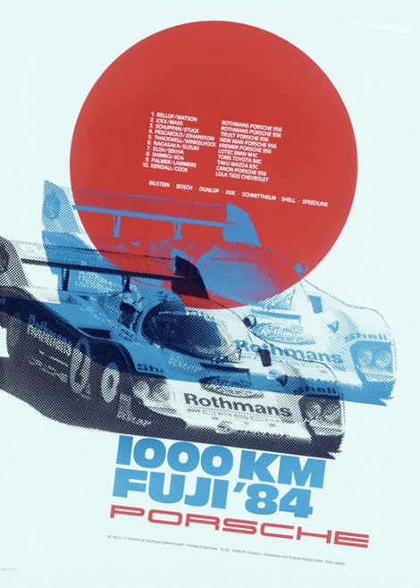
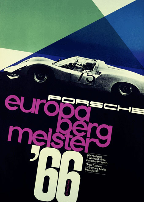 When I was 10, I wanted a Porsche 911 Carerra when I grew up. Still have time...
Love these posters from Grain Edit. More here.
Monday, April 13, 2009
How the typeface Sand ruined the most amazing video in months

Click here for the truly amazing video. (Take your Dramamine®)
The typeface "Hawaiian Starlight" in Sand makes me want to hurl more than the spinning of the stars.
Thursday, April 2, 2009
Typography In Venice
Kudos for Sam for finding this awesome poster on the streets of Venice, CA. You can really tell a lot about a person by the handwriting (and, of course the misspellings and punctuation).


Wednesday, April 1, 2009
Typographic Posters
From Big Spaceship. A collection (directory if you will) of some pretty fantabulous typographic posters.


Sunday, March 29, 2009

Thursday, March 26, 2009
"Vintage" Dharma Initiative ads

Monday, March 16, 2009
Watchmen Opening Titles

http://videolog.uol.com.br/video.php?id=418000
Also a great article over on LetterCult about the designer Corey Holms and the typography (Futura Condensed) of the Watchmen.
Sunday, March 15, 2009
Mutual of Omaha's Wild Kingdom Typography
My partner at work, Miguel brought this video to my attention. I forgot how much I liked not only the show, but the opening graphics. The posterized monochromatic animals, the old-school colors, the Indian (Native American, now) logo. But what is really beautiful, is the custom type in the beginning. Look carefully, and you'll see that no two letters are the same.
I noticed that it looked strangely familiar:

Then I realized, that it's highly likely that type designer Ed Benguiat designed the opening titles. I was unable to verify it, so if any one knows, let me know. Here are a couple of other pieces from Ed's type design. Here and here.
Thursday, March 12, 2009

Tuesday, March 10, 2009
Typoholism

From parachutefonts.com
For all of you out there, typography and twitter junkies, when you feel deprived of your regular dose of typographic inspirations, here is Typoholism, your new addiction. The guys responsible for the Read Between the Leading (Aaron Heth and Matt McInerney) have launched a new twitter aggregator for typography posts, tagged under #typoholism. Come and take your free dose!…
Friday, March 6, 2009
Helvetica. From a tube.


Download them here: http://www.autobahn.nl/grafisch_ontwerp/typografie/freshfonts.php
Subscribe to:
Posts (Atom)
