
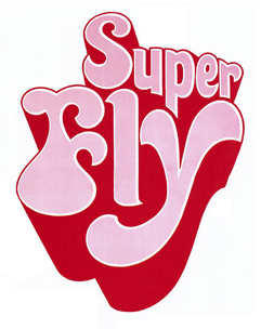
My partner at work, Miguel brought this video to my attention. I forgot how much I liked not only the show, but the opening graphics. The posterized monochromatic animals, the old-school colors, the Indian (Native American, now) logo. But what is really beautiful, is the custom type in the beginning. Look carefully, and you'll see that no two letters are the same.
I noticed that it looked strangely familiar:

Then I realized, that it's highly likely that type designer Ed Benguiat designed the opening titles. I was unable to verify it, so if any one knows, let me know. Here are a couple of other pieces from Ed's type design. Here and here.

No comments:
Post a Comment