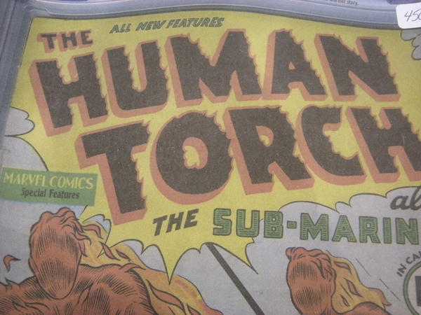
Case in point, "Brothers". The typeface on top is used in the one-sheets and obviously, the site. Love the disjointed cut style on the bottom.
But the trailer has the old stand-by. Trajan. What gives?


Typophile Film Festival 5 Opening Titles from Brent Barson on Vimeo.

From designer, Ken Perlin: "I wanted to design the smallest screen font that would actually be readable. My design assumes that screen pixels are horizontal striped as RGBRGB, as are most LCD screens these days"
See also smallest typeface.