Monday, January 25, 2010

Helveticookies


Mmmm, I could eat a whole stanza's worth.

I'm curious how the "O", "D", "B", "R", "P" and "Q" cookies handle the counter (empty space inside the stroke). Created by graphic designer, Beverly Hsu.

HT to the magnificent Don Lupo for the find

Monday, January 18, 2010

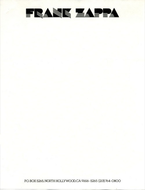
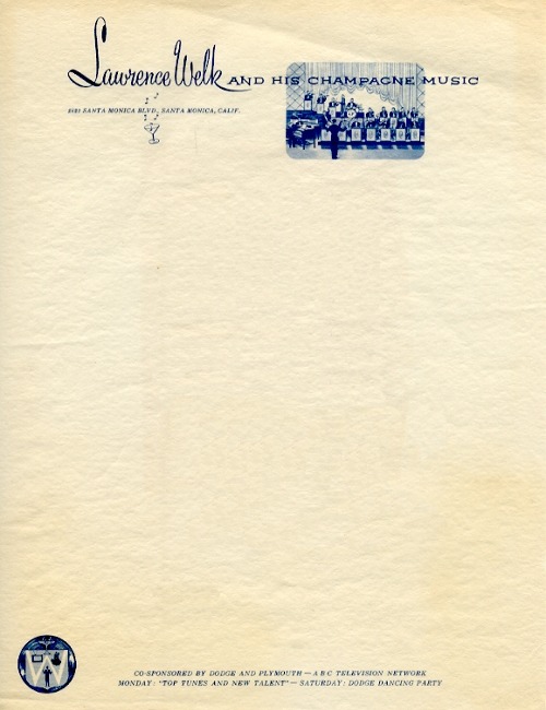
Interesting Letterhead pieces


A writer friend of mine, Robert Manley found this and thought his AD friends would find it interesting.

One word: yes.

here's the rest here.

Monday, January 4, 2010

Avatar and the worst possible font choice. Papyrus

I saw Avatar this weekend. And while the story was decent, the action was amazing and the special effects were mind-blowing, I don't understand why James Cameron chose the single worst typeface ever, Papyrus. Was Comic Sans not loaded in the designers' computer?

He uses it as the main logo


And as subtitles throughout


A mini Twitter revolt has begun, understandably. This film cost gazillions to make. They could've at least dropped some coin on a type designer to create a custom font. Shows how little respect the world of typography gets.

Friday, November 20, 2009

So Disappointed - Brothers Typeface

Why is it that studios market a film with a killer type treatment and then when it's time for trailers and the actual movie, they resort to boiler plate, status quo boringness?

Case in point, "Brothers". The typeface on top is used in the one-sheets and obviously, the site. Love the disjointed cut style on the bottom.

But the trailer has the old stand-by. Trajan. What gives?