Via Jessica Hische http://twitter.com/jessicahische/status/8824374345
Thursday, February 11, 2010
Sunday, January 31, 2010
My message in a bottle
I recently took part in a quickie quiz online that asked 8 or so questions about ABC's Lost. I managed to get them right, so they sent me (and 814 others) the below package. A note and a flash drive with a movie clip on it. I was under the assumption that the footage was exclusive, but looking on the ABC website, the clip was there, too. So, I'm guessing the exclusivity was the message, "Nothing's Irreversible." Which sounds a lot like an Adidas tagline.
Oh, and for the typophiles that follow this blog for typography stuff, the Lost logo looks like a variation on Impact, and the note is illustrated.
At any rate, I can't wait for the final season.
By the way, the video on the flash drive was 102 MB. Would've been cool if it was 108. (Nerd Level: Rising...)
Oh, and for the typophiles that follow this blog for typography stuff, the Lost logo looks like a variation on Impact, and the note is illustrated.
Monday, January 25, 2010
Helveticookies
Mmmm, I could eat a whole stanza's worth.
I'm curious how the "O", "D", "B", "R", "P" and "Q" cookies handle the counter (empty space inside the stroke). Created by graphic designer, Beverly Hsu.
HT to the magnificent Don Lupo for the find
Monday, January 18, 2010
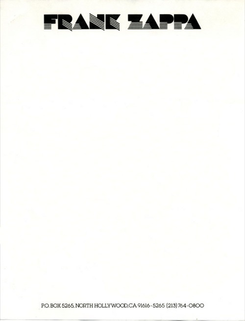
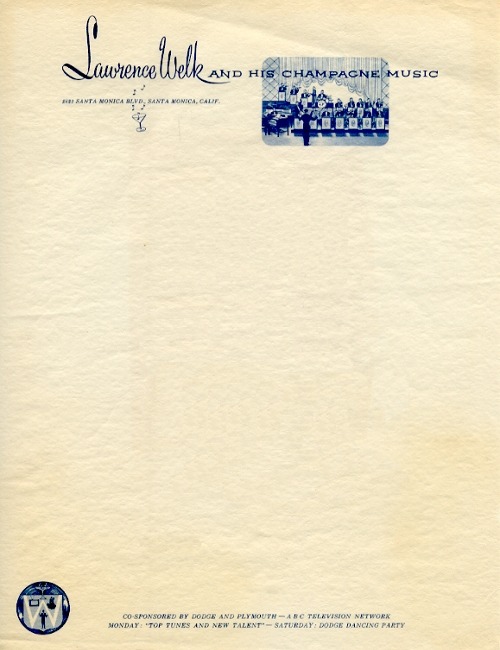
Interesting Letterhead pieces
A writer friend of mine, Robert Manley found this and thought his AD friends would find it interesting.
One word: yes.
here's the rest here.
Monday, January 4, 2010
Avatar and the worst possible font choice. Papyrus
I saw Avatar this weekend. And while the story was decent, the action was amazing and the special effects were mind-blowing, I don't understand why James Cameron chose the single worst typeface ever, Papyrus. Was Comic Sans not loaded in the designers' computer?
He uses it as the main logo


And as subtitles throughout

A mini Twitter revolt has begun, understandably. This film cost gazillions to make. They could've at least dropped some coin on a type designer to create a custom font. Shows how little respect the world of typography gets.
He uses it as the main logo
And as subtitles throughout
A mini Twitter revolt has begun, understandably. This film cost gazillions to make. They could've at least dropped some coin on a type designer to create a custom font. Shows how little respect the world of typography gets.
Thursday, December 17, 2009
Type T-Shirts
Tuesday, December 8, 2009
Superman/Batman Public Enemies
Love the title treatment for this. Via Art of the Title Sequence
Subscribe to:
Posts (Atom)